Creating an effective brand is challenging. It’s exhausting. It’s daunting. And I love the process. A recognizable brand that packs a design punch is invaluable to businesses large and small. It has hundreds of moving parts that work together to represent a company’s personality, mission and purpose.
Color is just one of these hundreds of parts, but, in my humble opinion, it is one of the most important. Color isn’t about just looking good. Color increases brand recognition by up to 80%. Studies show that black and white images hold the viewer’s attention for less than two-thirds of a second, while color images hold the viewer’s attention for two seconds or more.
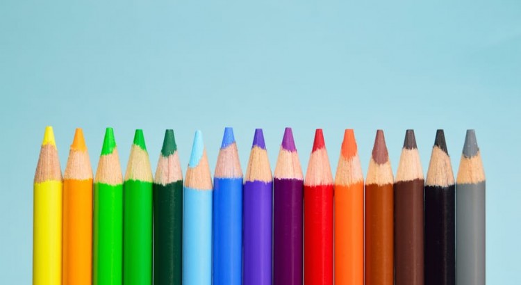
It’s a no-brainer that companies should use color in their branding, but while choosing a color palette is fun, it can also be frustrating. Color preference is subjective and research regarding color psychology can sometimes be watered down. But, with a little digging, I compiled the following theories about color that are widely held by professionals.
Red
Coca-Cola has cornered the red market with its iconic red and white logo. This intense color evokes strong emotions and is notoriously hard to use without sparking a negative response. Seeing the color red can make the viewer’s heart beat faster, a reaction often associated with danger and unease. But if your brand is bold and daring, red might be the right signature color.
Orange
Shades of orange create a sense of urgency and demonstrate confidence and friendliness. Can you guess what United States brand has gone so far as to trademark this bright color for use in advertising, lettering and signage? If you’ve ever taken a stroll through a Home Depot, you know. The home improvement goliath covers every inch of blank space in its signature orange hue.
Yellow
Yellow gets a bad rap for allegedly making babies cry, but this cheerful color can also portray optimism, movement and warmth. Brands that want to be inviting, but also want patrons to move quickly, turn to yellow. Fast food restaurants – think McDonald’s unmistakable golden arches –often use yellow to inspire people to keep moving.
Green
Green is this year’s hottest color. Pantone’s color of the year, Greenery, is a refreshing shade that is symbolic of new beginnings and a return to nature. Brands have long used shades of green to express peace and make viewers feel grounded. Whole Foods Market fittingly uses a dark, grounded hue of green to market its fresh, organic brand.
Blue
Blue is often used in branding because of its reputation as a non-invasive color that is associated with peace and calm. With numerous shades to choose from, blue is used in many widely different industries. Dark blue expresses professionalism and stability and is often used by banks and other financial institutions. Lighter shades of blue express freedom and creativity. The most inspiring use of blue has to be by Tiffany & Co., which has trademarked its iconic “robin’s egg” blue as Tiffany Blue. That’s dedication to a color.
Purple
Deep, rich shades of purple have been associated with royalty for centuries. As a result, the color is often used by sophisticated, luxury brands. You may not think of sophistication when you think of chocolate, but Cadbury is known for its luxurious chocolate and its deep purple logo.
Are you ready to build a color palette that will make your brand pop? If you need a little nudge in the right direction, contact my team for a consultation.